
After demoting its premium Pentium brand to the status of a jumped up Celeron with the release of its new Core-branded CPUs, it looks as though Intel has now decided to complete its CPU branding overhaul with a batch of new logo designs.
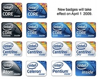
Eschewing the classic tall and narrow logos that have been stuck on the front of PCs since the original Pentium era in 1993, most of the new logos appear to be shorter and wider instead. As well as this, they apparently also feature a part of an internal die shot in the top right corner, with 'Inside' printed on the bottom right, while the Intel logo and CPU brand is printed on the left.
Fudo at Fudzilla claims to have got hold of several of the new logos (pictured), which encompass the new Core i7 processors, as well as the Core 2 Duo and Quad CPUs. It also looks as though the Centrino and Centrino 2 logos are being refreshed as well, along with the Centrino and Core 2 vPro emblems.
Meanwhile, according to the pictures, Intel’s Itanium, Xeon and Core 2 VIIV badges will stick with the original style of tall logos. However, we've also spotted that there's one slightly different Xeon logo with a light grey-blue background, which we assume will be used for the upcoming Nehalem--based Xeon CPUs such as the recently announced eight-core Nehalem-EX.
Worryingly, Fudzilla reports that the new logos will be introduced on 1 April this year, but the pictures certainly look genuine enough to us.
Do you like the new logos? Let us know your thoughts in the forums.
RELATED ARTICLES


MSI MPG Velox 100R Chassis Review
October 14 2021 | 15:04

Want to comment? Please log in.