20" widescreen monitor group test
March 30, 2006 | 21:36
Companies: #acer #benq #nec #test #viewsonic

Viewsonic VX2025
Native resolution: 1680x1050Contrast ratio: 800:1
Brightness: 300cd/m2
Response time: 8ms
Price: £340
In terms of specifications, this looks exactly the same as the BenQ. However, in practice, there is a world of difference. We will tell you straight up that we really like this monitor!

The hardware
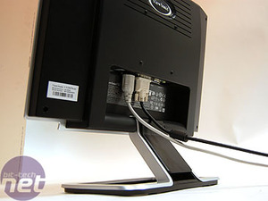
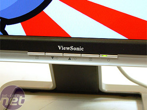
Menu and controls: We can only repeat here what we said about the Viewsonic controls previously. The menu system, and the buttons to control it, are unintuitive and pretty horrid all round. Definitely the chink in an otherwise shiny piece of armour.Ergonomics: Like most of the other monitors here, vertical tilt is all that you're going to get. However, in terms of reclaiming desk space, we like the fact that the stand is 'hollow', making a great place to put your pens and post-it notes.
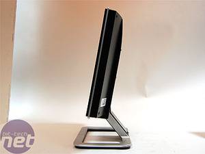
Design: We think this design is pretty slick. The combination silver and black bezel looks pretty trendy and flash. We liked it back on the the VX924 and we like it here, too.
Screen and viewing angle: The viewing angle is mostly the same as on the BenQ FP202W - a little better than the other Viewsonic, the 2012W. The brightness and viewing angle is a little worse here than on the NEC, which has the funky Opticlear coating. However, the picture is very good overall.


Testing
Display Mate: The greys in our banding test had a slight blue tinge, but this is more of a 'characteristic' of the display, with a slight blue cast on whites giving a fairly good picture. The definition of individual shades at the ends of the scale was worse than on the NEC, but it was crucially able to sustain a better balance between white and black than that display, giving it a better range of colour. We thought that whites looked better than blacks, and other colours were well balanced.Quake 4: Proving that artificial tests aren't everything, we found this the best display for gaming, hands down. Playing our dark Quake level, we were able to pick out more detail than on any other display. There was a great differential of blacks, and the greys and whites were maintained at a good level. We maxed out the brightness and contrast and thought that the picture was as close to a good CRT as we've seen on a LCD.
Crouching Tiger: We thought the same about our video test. There was the most detail found in the picture than of any panel, and the most realistic blacks and greys. The colour was at a good level - not over saturated and not under bright. There seemed to be less grain and the whites were less blown out than on the NEC panel.
Miami Vice: Capping off a three from three, this was definitely the best picture of the test. Colours were more even, with very black areas containing more detail.
RELATED ARTICLES


MSI MPG Velox 100R Chassis Review
October 14 2021 | 15:04

Want to comment? Please log in.