
Introduction
We've all been there - flipping through our display properties and seeing the colour quality setting. Which to choose, which to choose...higher is better, right? And so we all flip to 32-bit, convinced that we're seeing the best that our computers can offer. We are...aren't we?Well, maybe. You see, colour quality, known more accurately as "colour depth" is actually a pretty intricate science - one that is incredibly important, but very rarely discussed. Why? Well, let's just start with the fact that you'd be surprised how many of the current displays on the market fall short of expectations. We'll get into more detail on that later, though.
The truth is, colour depth is an inexact science from the start - not because of the digital aspects of it, but because of the so-called "analogue" aspects of our eyes (something we'll also touch on). In fact, there's a myriad of variables that determine whether you'll ever see the benefits of that highest setting on your system.
However, before we get into that, it's helpful to know exactly what we're talking about.
Turning the light on
Before we can understand some of what's going on in the world of colour depth, it's helpful to go back to the basics - the ideas of colour and light. Light is, more or less, an exact science now. It's physically defined, it can be specifically measured in the unit of Candelas (in terms of intensity) and has predictable behaviour.Colour, on the other hand, is a bit trickier. It is the perception of certain wavelengths of light - specifically, in humans it is known as the "visible" spectrum, between 400nm (violet) and 700nm (red). Light with shorter wavelengths than 400nm is too high-energy for humans to discern, known as ultra-violet (UV). Light that is of lower energy (and thus a longer wavelength) than 700nm is too low, and is known as infra-red (IR). Any object that radiates heat is actually radiating a certain amount of "light" in this spectrum, which is how IR cameras work.
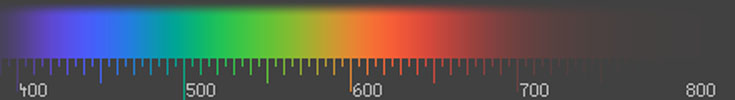
The "visible spectrum" of light is comprised of wavelengths roughly between 400nm and 700nm.
Within the "visible" spectrum, we have a perfect gradation of all possible colours. But since all colour is a specific wavelength of light, but
most light isn't red or green or purple, why do we end up with things that are red and green and purple?
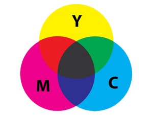
Well, colour is defined as much by what something isn't as what it is. Let me explain - when you shine a white light onto a ball, the compounds on the surface of that ball absorb some light, and reflect others. If the ball is very red, it is absorbing all light in the spectrum but red, which then gets reflected back to your eye. This is something known as subtractive colour - using different dyes and pigments to absorb the colours you don't want. If something absorbs all of the light that is shined on it, it appears black - the absence of colour.
By definition, if black is the absence of all colour, then white is the existence of all colours equally - and it is. If you shine an LED representing each main part of the spectrum (red, green, and blue, specifically) in equal brightness, you end up with white light. This is what we call additive colour - adding light of different colours to make white.
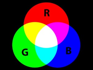
Left: The RGB colour space is additive colour, and is used for lighted displays like LCD and CRT monitors;
Right: The CMYK colour space is subtractive colour, and is used for printing and reproduction.
Each type of colour, both additive and subtractive, has its uses in different spaces - and even use different "main" colours to achieve them. When you have something light-emitting like an LCD display, you'll usually work in "RGB" colour space - that is additive colour. If you work in printing and magazines, which have to rely on the light around the reader, you'll usually work in a "CMYK" colour space (for Cyan, Magenta, Yellow, Black), which is subtractive colouring.
Wow, it sounds pretty defined, doesn't it? So why did I make it sound like all of this isn't so concrete? Well, though the basic definitions seem solid, there's one key word from the definition of colour - it's all about perception. But before we get into that, let's take a look at how this basic theory applies to the monitor you're reading this article on now.
RELATED ARTICLES


MSI MPG Velox 100R Chassis Review
October 14 2021 | 15:04

Want to comment? Please log in.