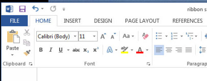
Next up is the simple fact that I think Microsoft has failed to fix the problem of having an overly complicated toolbar layout. If you actually stop and look at the Home tab of the Ribbon in Word it is anything but a streamlined complication free interface. It has 39 items on it which are arranged in a multitude of different ways. Contrast that with the default toolbars in Word 2003 where you have just 22 items that are all arranged in a much tidier, easier to read manner.
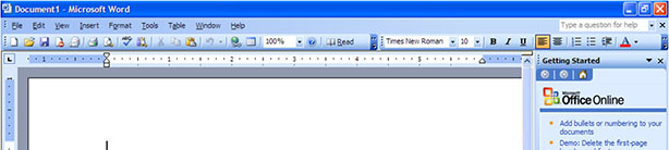
The default toolbar layout in Word 2003 (above) is much less complex than the Ribbon of Word 2013 (below).
Now obviously numbers don’t tell the whole story but clearly when the intention was to make the interface easier to use, having more options is at the very least counter intuitive. What’s more, the choice of options is peculiar. For instance does the average user really use Format Painter or the Styles system?
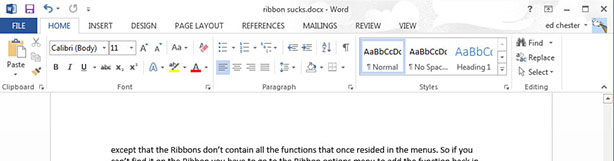
Meanwhile the Print button is now no more, with print functions now residing in the File menu, and Undo and Save are now up in the very top left corner in another new feature called the Quick Access toolbar. Confused much?!
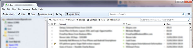
If you want an example of just how cluttered Microsoft’s Office products now look, just compare Outlook to Mozilla’s Thunderbird email client, as shown below. Now Thunderbird is a much simpler program than Outlook but not so much so that it totally excuses the difference in interface clarity. I’m also not saying Thunderbird is perfect – far from it – but I know which I find more approachable. By default Thunderbird is also much easier to use thanks to better choice of fonts and layout, but that’s another issue altogether. If you’re wondering where the Reply/Delete buttons are in Thunderbird, they appear in the preview pane when you click on an email – a simple but effective way of decluttering.
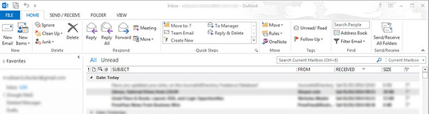
The Ribbon of Outlook 2013 (above) is far more complex than the simple interface of Thunderbird (below).
And the problems don’t stop there. As well as a cluttered layout and slightly odd selection of tools, Ribbon also suffers from inconsistency. As you flip from tab to tab within the Ribbon interface there’s no indication of where you might expect to find the selection of tools. Each tab is a unique arrangement of icons, drop downs and preview boxes. Now clearly that’s somewhat inherent to having a relatively dynamic and graphically driven interface – and there are benefits in having that – but there’s no denying it’s a bit confusing. In contrast, while not necessarily quicker there’s a consistency with being able to at the very least fall back on simple text menus.
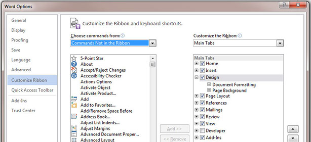
My final complaint is an extension of that last point. You see, in the latest versions of the Office apps there are no longer conventional drop down menus at all. Now this isn’t necessarily a bad thing except that the Ribbons don’t contain all the functions that once resided in the menus. So if you can’t find it on the Ribbon you have to open up a seperate popup or go to the Ribbon options menu to add the function back in.
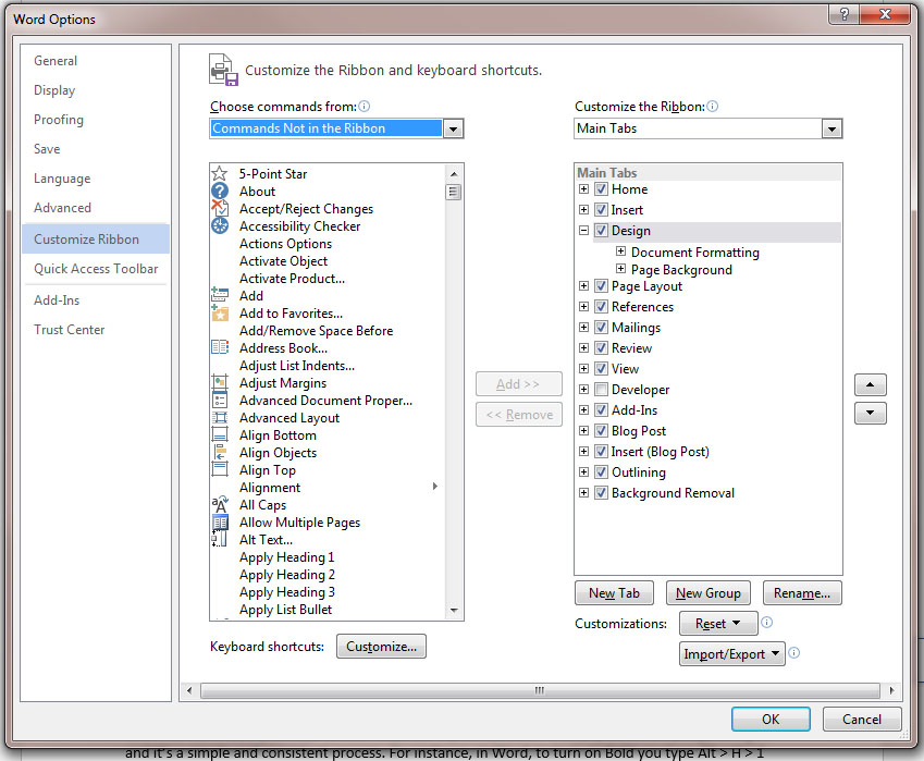
You may think this a very niche complaint but a quick look at the ‘Commands not In the Ribbon’ section of the Ribbon customisation popup shows just how many functions aren’t available.
I do have a few other complaints such as the bizarre File menu in the latest version of Office that fills the entire window when you open it and the lack of support for having the Ribbon arranged vertically to use screen space more efficiently, but I’ll stop there. Instead I’ll finish up by highlighting what I feel the interface should provide, and the answer is actually very simple.
The basic premise of the Ribbon should be adhered to but the focus should be entirely on simplicity. So instead of pushing as many functions as possible onto a whole host of tabs, there should just be a selection of the most common tools – in the region of 10 or 20 items. Whatever the program is the approach should be one of ‘what are the top ten things people do when using this program?’ and the tools should be those and those only. So no, don’t give me Format Painter or a Change Case button in Word because only a handful of people use those functions.
But, the crucial point is that to address the needs of power users the toolbar/s should be fully customisable and supported by a compact menu system. So if you do use Format Painter you can simply drag and drop the item from a traditional drop down menu to the Ribbon. The current Ribbon interface does actually allow for complete customisation but not only is it pretty darn complicated it’s the idea you have to work backwards from the mess that you’re first presented with – and that the facility is hardly highlighted – that makes it so counter-intuitive. By starting with the basics and making it really obvious how to augment those features you make it easier for everyone.
Designing a UI is of course a very difficult thing, especially for a long standing and powerful software suite - let alone an OS - but I feel Microsoft fundamentally took a wrong turn with Ribbon and it's time someone did something about it. Over to you, Satya.
Have you grown to like the Ribbon interface? Did you like it from the start? Or, like me, do you still find it a bit of headache?
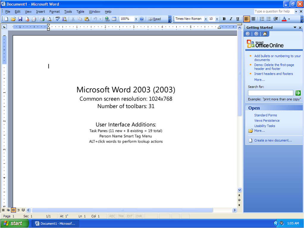
The default toolbar layout in Word 2003 (above) is much less complex than the Ribbon of Word 2013 (below).

Now obviously numbers don’t tell the whole story but clearly when the intention was to make the interface easier to use, having more options is at the very least counter intuitive. What’s more, the choice of options is peculiar. For instance does the average user really use Format Painter or the Styles system?
Meanwhile the Print button is now no more, with print functions now residing in the File menu, and Undo and Save are now up in the very top left corner in another new feature called the Quick Access toolbar. Confused much?!
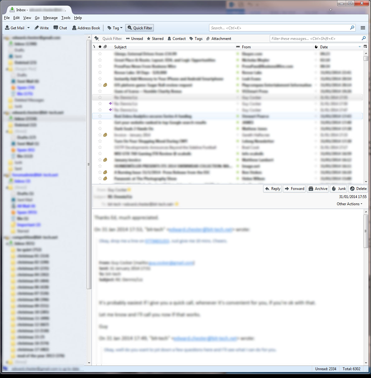
If you want an example of just how cluttered Microsoft’s Office products now look, just compare Outlook to Mozilla’s Thunderbird email client, as shown below. Now Thunderbird is a much simpler program than Outlook but not so much so that it totally excuses the difference in interface clarity. I’m also not saying Thunderbird is perfect – far from it – but I know which I find more approachable. By default Thunderbird is also much easier to use thanks to better choice of fonts and layout, but that’s another issue altogether. If you’re wondering where the Reply/Delete buttons are in Thunderbird, they appear in the preview pane when you click on an email – a simple but effective way of decluttering.
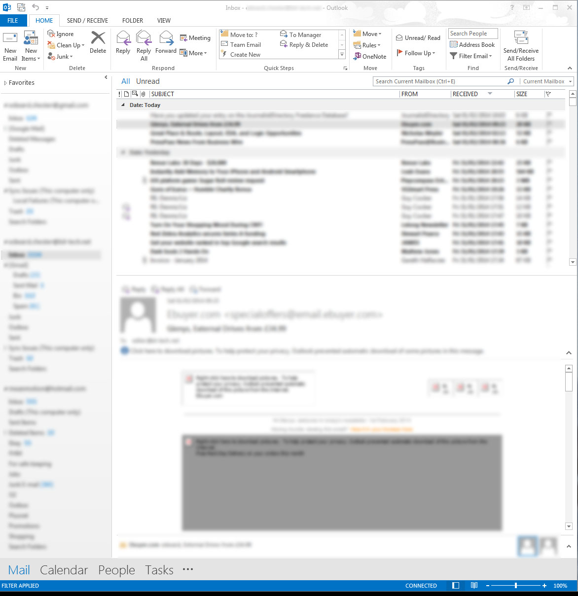
The Ribbon of Outlook 2013 (above) is far more complex than the simple interface of Thunderbird (below).
And the problems don’t stop there. As well as a cluttered layout and slightly odd selection of tools, Ribbon also suffers from inconsistency. As you flip from tab to tab within the Ribbon interface there’s no indication of where you might expect to find the selection of tools. Each tab is a unique arrangement of icons, drop downs and preview boxes. Now clearly that’s somewhat inherent to having a relatively dynamic and graphically driven interface – and there are benefits in having that – but there’s no denying it’s a bit confusing. In contrast, while not necessarily quicker there’s a consistency with being able to at the very least fall back on simple text menus.
My final complaint is an extension of that last point. You see, in the latest versions of the Office apps there are no longer conventional drop down menus at all. Now this isn’t necessarily a bad thing except that the Ribbons don’t contain all the functions that once resided in the menus. So if you can’t find it on the Ribbon you have to open up a seperate popup or go to the Ribbon options menu to add the function back in.
You may think this a very niche complaint but a quick look at the ‘Commands not In the Ribbon’ section of the Ribbon customisation popup shows just how many functions aren’t available.
I do have a few other complaints such as the bizarre File menu in the latest version of Office that fills the entire window when you open it and the lack of support for having the Ribbon arranged vertically to use screen space more efficiently, but I’ll stop there. Instead I’ll finish up by highlighting what I feel the interface should provide, and the answer is actually very simple.
The basic premise of the Ribbon should be adhered to but the focus should be entirely on simplicity. So instead of pushing as many functions as possible onto a whole host of tabs, there should just be a selection of the most common tools – in the region of 10 or 20 items. Whatever the program is the approach should be one of ‘what are the top ten things people do when using this program?’ and the tools should be those and those only. So no, don’t give me Format Painter or a Change Case button in Word because only a handful of people use those functions.
But, the crucial point is that to address the needs of power users the toolbar/s should be fully customisable and supported by a compact menu system. So if you do use Format Painter you can simply drag and drop the item from a traditional drop down menu to the Ribbon. The current Ribbon interface does actually allow for complete customisation but not only is it pretty darn complicated it’s the idea you have to work backwards from the mess that you’re first presented with – and that the facility is hardly highlighted – that makes it so counter-intuitive. By starting with the basics and making it really obvious how to augment those features you make it easier for everyone.
Designing a UI is of course a very difficult thing, especially for a long standing and powerful software suite - let alone an OS - but I feel Microsoft fundamentally took a wrong turn with Ribbon and it's time someone did something about it. Over to you, Satya.
Have you grown to like the Ribbon interface? Did you like it from the start? Or, like me, do you still find it a bit of headache?
RELATED ARTICLES


MSI MPG Velox 100R Chassis Review
October 14 2021 | 15:04

Want to comment? Please log in.