20" widescreen monitor group test
March 30, 2006 | 21:36
Companies: #acer #benq #nec #test #viewsonic

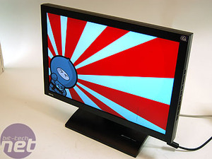
BenQ FP202W
Native resolution: 1680x1050Contrast ratio: 800:1
Brightness: 300cd/m2
Response time: 8ms
Price: £317
The BenQ FP202W monitor has a higher contrast ratio than the Viewsonic on the previous page, making it better on paper. However, the rest of the specifications are pretty similar, with the same brightness and response time of 300cd/m2 and 8ms respectively. We found this to be true looking at the actual monitor - the picture seemed pretty similar in general desktop usage, although there were differences in performance as we'll come to see.
The hardware
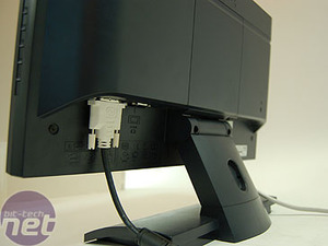
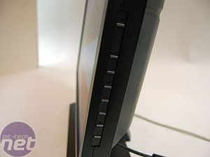
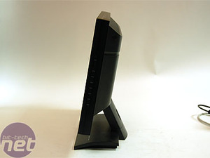
Menu and controls: The buttons to control and monitor are actually on the right side of the bezel. This makes the front look pretty sleek and plain, but it means that, initially, you have to keep swivelling it around to try and work out what you should be doing. The actual menu system itself is fairly clear and simple, but the constant fiddling to find the right buttons can be a pain. As with any button-driven interface, familiarity over time delivers the ability to adjust settings without looking.Ergonomics: The FP202W is the only monitor here to have height adjustment - it can extend up 10cm from its base height. This isn't a whole lot, and it isn't accompanied by an appropriate rotation (apart from physically turning the base of the monitor) but it's better than than the others.
Design: The bezel and the housing for the monitor is rather minimalistic. It's decked out in a dark navy, rather than a black, giving it something of a professional feel - rather like the old Silicon Graphics machines. It's hard to dislike, being rather neutral; on the other hand, it's hardly on the cutting edge of design.
Screen and viewing angle: Overall, the screen was totally adequate, and had a better vertical viewing angle than the previous Viewsonic. We found nothing offensive in the finish or brightness on the screen, once we'd had a play with the Brightness and Contrast settings.
Testing
Display Mate: The grey bands on the monitor were actually among the best on test here. However, this (unfortunately) wasn't carried on to the black differentiation tests, where we found that all the low-end shades were very murky, even with the brightness turned right up to maximum. We also found very bad compression in the tests that show the steps between colour shades - even worse than on the Viewsonic monitor. Not cool.Quake 4: Here, the blacks weren't too bad, but they weren't exactly brilliant. The other colours were quite good, and certainly better than the Viewsonic - but barely.
Crouching Tiger: We saw the same over saturation of colour here, and we again saw problems with the brightness. We had to pull it right down to get anything like a black in our night scene. We also found that DVD playback in general didn't scale particularly well; moving from 720 x 576 to 1680x1050 requires what is essentially a 100% upscale. Again, not a fantastic viewing experience.
Miami Vice: Here we thought the bright colours in the picture were pulled off well, but the problems the display has with blacks rather emphasised the grain and made the whole picture end up a little dull.
RELATED ARTICLES


MSI MPG Velox 100R Chassis Review
October 14 2021 | 15:04

Want to comment? Please log in.