
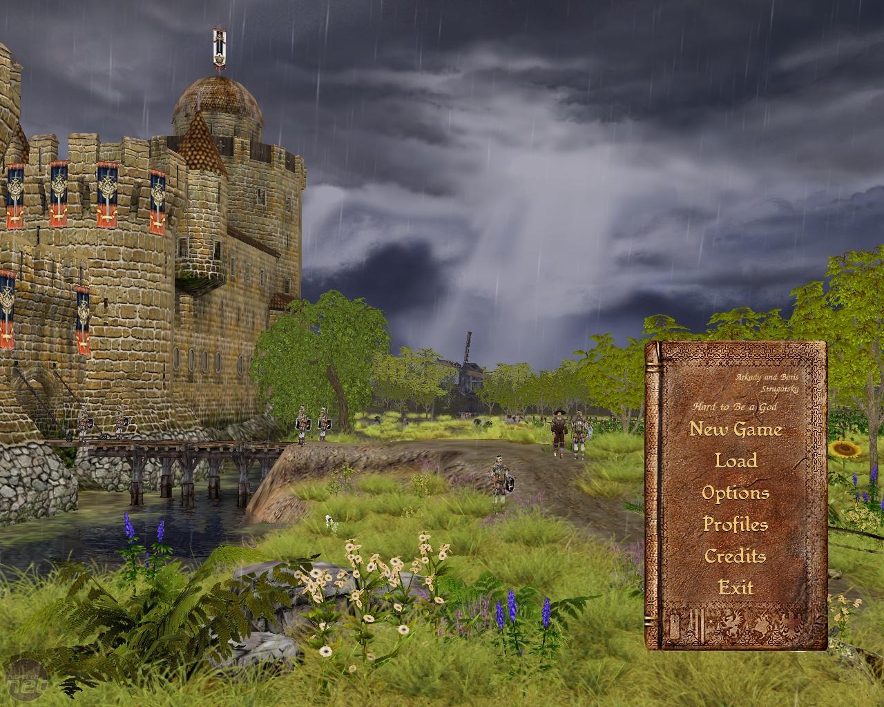
Hard to be this good-looking
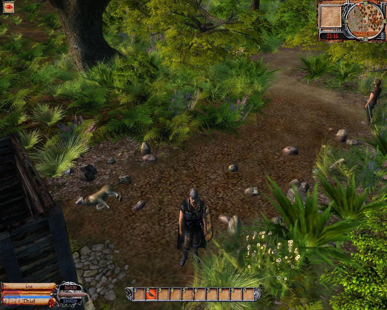
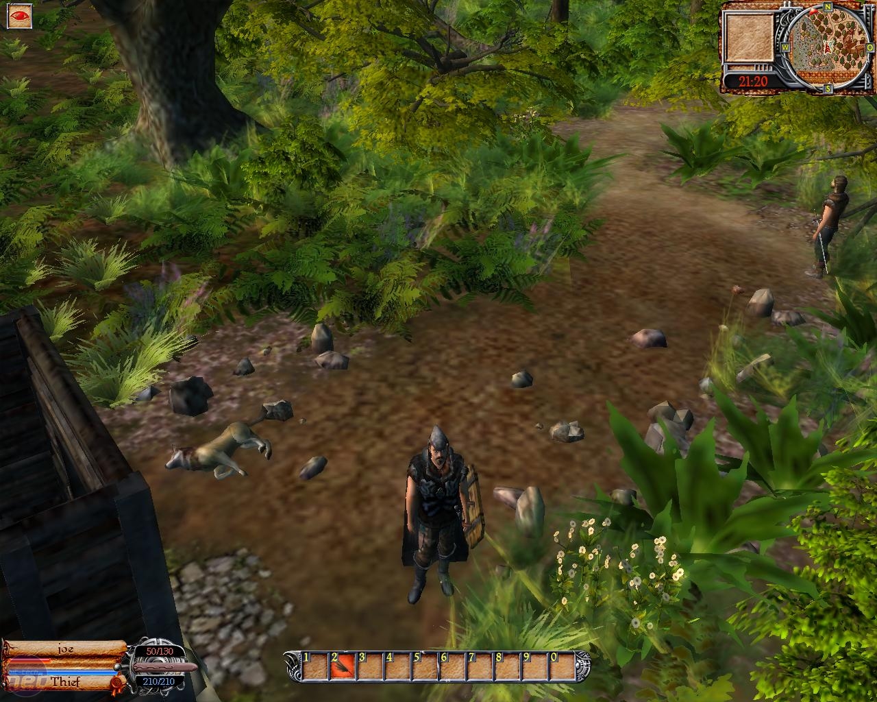
Now we come to it – the graphics. If you’ve read this far and clicked on even on single screenshot then it should be fairly obvious to you that graphically Hard to be a God is a bit of a let-down to say the least.We’d love to say that the low-level graphics were compensated for by huge levels or incredibly involving gameplay – but we can’t. Or, rather, we could tell you that but we would be lying.
The truth of the matter is that the game just looks pants, plain and simple.
Still, even with a game like Hard to be a God which was plainly beaten with the ugly-stick by its parents as if it were a red-headed step-child, there’s some merit to be had in dissecting the incredibly limited graphics options – even if that merit is only so you can point and laugh at it.
Texture Quality
There are three settings in Hard to be a God for Texture Quality – Low, Medium and High. It’s pretty clear what they do in theory, so check out the screenshots below to see the actual effect.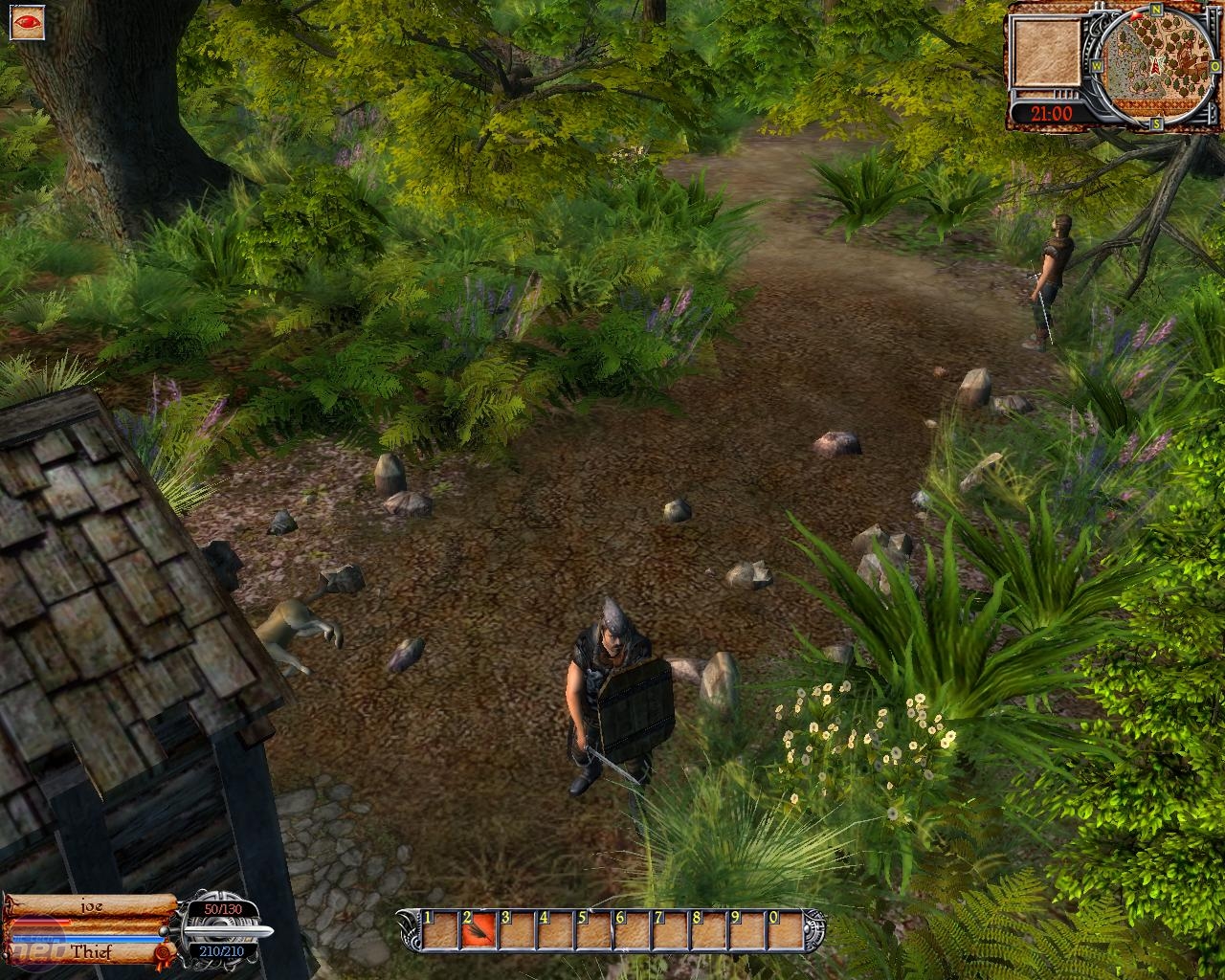
Texture Quality on High (left), Medium (centre) and Low (right)
Yeah, it’s pretty shocking how ugly the game can get isn’t it? On the high settings the textures are just about tolerable for a modern game – provided you squint and turn your head to the right a bit .
On the low settings though it’s a different story altogether – the path is starting to look like a swamp and basically the whole game looks as if it were viewed through glasses made of milk bottle ends. Keep the setting as high as you can.
Bloom
Bloom is one of those settings which sounds nice and fancy to the unwashed masses, but is actually incredibly commonplace. Or, at least, it’s common enough to make it toggleable in a game that looks this bad. Either way, it comes in two flavours; on or off.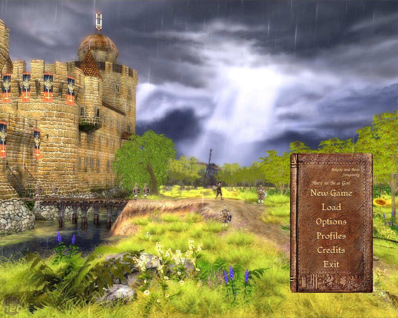
Bloom On (left) and Off (right)
The difference between the two is actually quite striking here and has absolutely no performance hit at all, so really it’s just a matter of taste whether you want it on or not. Notice though that turning the option off does make the scene look a lot duller and less interesting – the bloom takes with it any of the vibrancy that the lighting bought to the scene.
Personally, we recommend keeping the setting turned on – but it’s completely subjective. Turn the setting off if you want, neither option will make the game look any better.
Water Quality
Now, this is an odd setting – not because it has any real effect on performance or graphical quality, but more because the game features so little water most of the time. There are oceans and streams to see, but only occasionally and the development time for setting this option would have been better spent increasing the overall polygon count of the game models.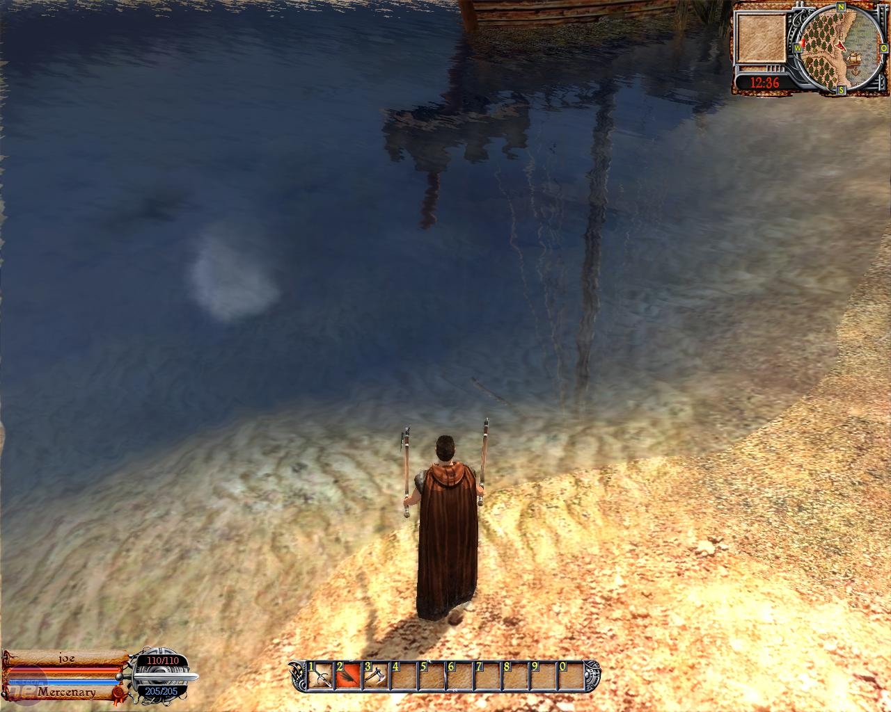
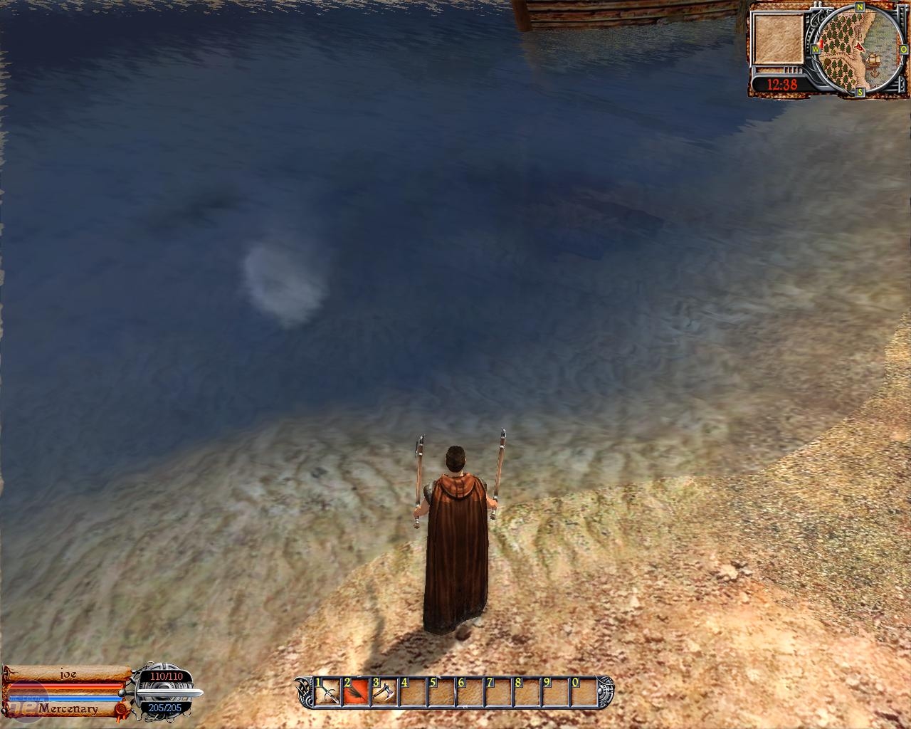
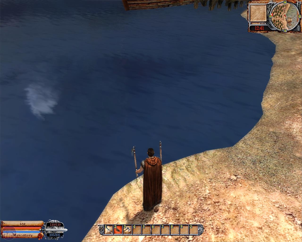
Water Quality on High (left), Medium (centre) and Low (right)
There’s a definite, stark difference between the three different settings and the lowest level really does make you appreciate how good other games can look.
Actually, on the highest setting the game doesn’t look all that bad – there are reflections, some surf and the water has some translucency. Compare that to the solid blue jelly of the lower setting and you’ll understand why we recommend putting this option as high as possible.
RELATED ARTICLES


MSI MPG Velox 100R Chassis Review
October 14 2021 | 15:04


Want to comment? Please log in.