Over the last few weeks I’ve been thinking about what exactly makes graphics in a game good and why it is that some of my favourite indie games look better than the latest games despite having lower polygon counts.
What exactly is the difference between good graphics and great presentation?
To put it simply and dryly, good graphics are the type of unneeded visual flair that cause jaws to drop and eyes to dry. It’s hard to specifically define because it’s both indistinct and ever-changing thanks to the nature of the business, but good graphics generally means high polygon counts, lots of explosions and loads of light sources. Everything should be dynamic and smooth.
Good presentation however is totally different. It’s a singularity of vision that works itself through an entire game, emanating from core to keyboard. It’s how the graphics are used and the way that elements of the story are told through visual cues.
For me, the difference between graphics and presentation can be illustrated through one simple comparison.
[break]
First, think back to Doom 3 – a game with great graphics, but a bland and dismal space marine schtick to it. All the corridors are the same and it seems that everyone other hallway is decorated with non-descript pentagrams and pseudo-arcane symbols drawn in blood.

Half-Life 2: A picture says a thousand words
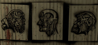
Then compare that to Half-Life 2 – a game that wasn’t as visually impressive from a technical perspective, but which had a truly involving sense of drama to it. The graffiti and wall decorations in City 17 are completely different; posters and stencilled art in the alleys hint at the history of the Combine, while Lambda emblems can imply a sympathetic emotion of fearful revolution in the NPCs.
Compared to the intelligently designed posters of Half-Life 2, Doom 3’s pentagrams are utterly thoughtless. Someone has obviously put them there because Blood + Demons = Scary, whereas Valve was trying to communicate something with their décor. All Doom 3 is hinting at is the self-evident hellishness of the enemies, whereas Half-Life 2 tells us so much more.
Doom 3 would have us believe that the Imps and Hell Knights have nothing better to do than scrawl elaborate diagrams on the walls, whereas Half-Life 2 tells of rebels who wanted to be heard – but were too scared to wait for the paint to dry.
Carmack and Co. could defend themselves with the argument that stencilled art ala Freeman wouldn’t suit Doom 3, but that’s a lame excuse. There are plenty of ways to imply the same idea, better – and there are better ideas to try and imply, honestly.
Looking back on some of my favourite games it increasingly seems that the really great titles aren’t always the ones with fantastic graphics, but the ones with a unique style that credits the player with some intelligence. Valve does the same thing in Left 4 Dead by leaving covered bodies lying around that suggest this corpse was once a part of another survivor group, conjuring a moment of empathy. Somebody liked this person enough to cover their body with a sheet, despite the chaos.
Valve isn’t the only developer who does it though and I’m not going to do the usual PC gamer thing of holding Valve up as a god. Honestly, a lot of developers have done it better than Valve. Double Fine implies a huge amount about its characters by their wardrobes in Psychonauts. Looking Glass’ unique cutscene style in Thief says more than any tie-in novel. The radio stations in GTA are about more than humour.
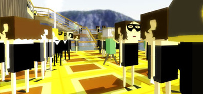
And no, I’m not really going anywhere with this – it’s just something that I thought of and thought I might be able to articulate semi-decently today. Likewise, I don’t have a particular reason for linking to Brendon Chung’s website either. He’s an indie developer I’ve been following for a few years now and he’s someone who’s got the process of presenting bizarre, illogical worlds down to a fine art. Check him out and let me know what you think.
Joe, out.
What exactly is the difference between good graphics and great presentation?
To put it simply and dryly, good graphics are the type of unneeded visual flair that cause jaws to drop and eyes to dry. It’s hard to specifically define because it’s both indistinct and ever-changing thanks to the nature of the business, but good graphics generally means high polygon counts, lots of explosions and loads of light sources. Everything should be dynamic and smooth.
Good presentation however is totally different. It’s a singularity of vision that works itself through an entire game, emanating from core to keyboard. It’s how the graphics are used and the way that elements of the story are told through visual cues.
For me, the difference between graphics and presentation can be illustrated through one simple comparison.
[break]
First, think back to Doom 3 – a game with great graphics, but a bland and dismal space marine schtick to it. All the corridors are the same and it seems that everyone other hallway is decorated with non-descript pentagrams and pseudo-arcane symbols drawn in blood.

Half-Life 2: A picture says a thousand words
Then compare that to Half-Life 2 – a game that wasn’t as visually impressive from a technical perspective, but which had a truly involving sense of drama to it. The graffiti and wall decorations in City 17 are completely different; posters and stencilled art in the alleys hint at the history of the Combine, while Lambda emblems can imply a sympathetic emotion of fearful revolution in the NPCs.
Compared to the intelligently designed posters of Half-Life 2, Doom 3’s pentagrams are utterly thoughtless. Someone has obviously put them there because Blood + Demons = Scary, whereas Valve was trying to communicate something with their décor. All Doom 3 is hinting at is the self-evident hellishness of the enemies, whereas Half-Life 2 tells us so much more.
Doom 3 would have us believe that the Imps and Hell Knights have nothing better to do than scrawl elaborate diagrams on the walls, whereas Half-Life 2 tells of rebels who wanted to be heard – but were too scared to wait for the paint to dry.
Carmack and Co. could defend themselves with the argument that stencilled art ala Freeman wouldn’t suit Doom 3, but that’s a lame excuse. There are plenty of ways to imply the same idea, better – and there are better ideas to try and imply, honestly.
Looking back on some of my favourite games it increasingly seems that the really great titles aren’t always the ones with fantastic graphics, but the ones with a unique style that credits the player with some intelligence. Valve does the same thing in Left 4 Dead by leaving covered bodies lying around that suggest this corpse was once a part of another survivor group, conjuring a moment of empathy. Somebody liked this person enough to cover their body with a sheet, despite the chaos.
Valve isn’t the only developer who does it though and I’m not going to do the usual PC gamer thing of holding Valve up as a god. Honestly, a lot of developers have done it better than Valve. Double Fine implies a huge amount about its characters by their wardrobes in Psychonauts. Looking Glass’ unique cutscene style in Thief says more than any tie-in novel. The radio stations in GTA are about more than humour.
And no, I’m not really going anywhere with this – it’s just something that I thought of and thought I might be able to articulate semi-decently today. Likewise, I don’t have a particular reason for linking to Brendon Chung’s website either. He’s an indie developer I’ve been following for a few years now and he’s someone who’s got the process of presenting bizarre, illogical worlds down to a fine art. Check him out and let me know what you think.
Joe, out.

MSI MPG Velox 100R Chassis Review
October 14 2021 | 15:04


Want to comment? Please log in.