Thoughts on HUD Design
July 31, 2010 | 15:06
Heads-up displays are, to me, a far more contentious issue than some of the other more bandied-around topics in modern game design. Everyone cries about regenerating health and how many weapons a player can feasibly carry, but HUDs seem a lot closer to the real, underlying complaints these other issues hint at. Instead of worrying about whether players have regenerating health, what about considering if the player should even know how much health they have left?
The issue of how health and ammo should be presented though is only secondary to the far bigger question of if they should be presented at all. Whereabouts do you draw the balance between accessibility and realism? In most shooters there's no logical reason why your character should have an ammo counter in the corner of the screen. It's only there because the player needs that information in order to get the most out of the game. As players we just take that info for granted.
[break]
Personally, I don't mind whether the HUD is there or not, not really - it's just common sense that different problems need different solutions. Half-Life without a HUD would be a much worse game than Half-Life with a HUD, while Mirror's Edge would be significantly weakened if it did. Tomb Raider needed to have a health meter on the screen, but Silent Hill needed to not have one. No one approach will suit all games.

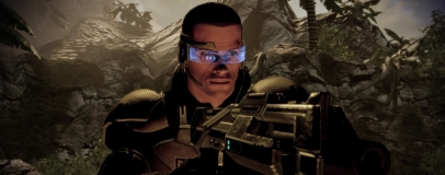
Ze goggles! Zay explain everything!
Instead, what bothers me is the way that some developers seem to follow HUD conventions blindly, lobbing the health meter in the bottom left and the ammo counter in the bottom right without thinking. That approach is fine for something such as Serious Sam, because you need that information to play, but there are plenty of games which claim to reach higher. The developers of BioShock are keen to discuss how they keep players in a first person perspective to increase immersion…but they never explain why your character has an ammo counter on screen.
Not that you can blame them, really. Developers are always being praised for adding new features, but as soon as changes are wrought upon a game's interface then all sorts of nasty words start to be bandied about. Words such as 'unintuitive', 'unwieldy' and 'frustrating' - most of which translate only into 'not what I'm used to.'
Besides, we need information, don’t we? When you’ve got a gun in one hand and a bee-related plasmid in the other then it can be difficult to keep track of your resources. Walking into a fight with only three bullets in your gun might sound interesting the first few times, but if you keep dying because of it then it’ll get old very quickly. As a result, most developers just stick an ammo counter in the corner (because they know that works) and don’t feel a need to explain it (because they know players rarely question it).
Personally, I always question it and I think there are plenty of better solutions than just following the tradition of design. For starters, you can put a clear divide between the HUD and the immersion, like the first FPS games did. Doom, for example, relegated the health and ammo counters to a bar at the bottom of the screen, marking a separation – above the bar is what your character sees, below is what you need to know and the two don’t need to meet.
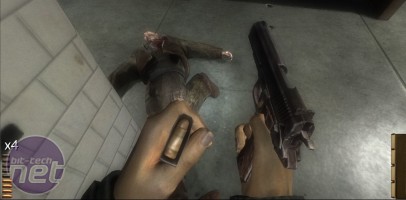
Just four bullets? Arse
Most survival horror games have a similar divide, pushing the health and ammo info into an entirely different screen. In Resident Evil you could gauge your overall health quickly by looking at your character, but if you wanted to know how much ammo you had left then you’d better look in your inventory. As a UI solution it made sense to have your character check his pockets in that way, but it also added tension to the action.
Failing that, it’s always possible to explain the UI away simply. Gordon Freeman knows how much ammo he carries because his HEV suit keeps track for him – and kindly administers painkillers when he takes massive injuries. The HUD in most Tom Clancy games too is a central feature – just look at GRAW, for example. All you need to do is give your Player Character a helmet, or integrate the ammo counter into the weapon.
My own favourite solution though is the hybrid system used in the original Condemned: Criminal Origins, which I maintain is one of the single scariest games I’ve played. A melee-focused first person shooter, fights in Condemned were often incredibly fast and very, very brutal. Enemies would charge at you suddenly, proceeding to smack you silly in record time – so you always needed to know how much health you had left.
When it comes to weapons though, things were a little different. Guns were present and powerful, but were rare enough that you were always limited to whatever was left in the clip. Thus, there was no real need for a proper ammo counter. If you wanted to check the ammo supply you had to literally pop the clip out and take a look, which was slow enough to stop you doing it in the middle of a fight. There were plenty of moments in a big brawls where you’d grab a pistol from a fallen foe and, unable to stop and take stock, would turn immediately on remaining enemies. Firearms were powerful enough to make you overconfident, but you usually came crashing down one you realised you’d wasted the only three bullets left.
The issue of how health and ammo should be presented though is only secondary to the far bigger question of if they should be presented at all. Whereabouts do you draw the balance between accessibility and realism? In most shooters there's no logical reason why your character should have an ammo counter in the corner of the screen. It's only there because the player needs that information in order to get the most out of the game. As players we just take that info for granted.
[break]
Personally, I don't mind whether the HUD is there or not, not really - it's just common sense that different problems need different solutions. Half-Life without a HUD would be a much worse game than Half-Life with a HUD, while Mirror's Edge would be significantly weakened if it did. Tomb Raider needed to have a health meter on the screen, but Silent Hill needed to not have one. No one approach will suit all games.
Ze goggles! Zay explain everything!
Instead, what bothers me is the way that some developers seem to follow HUD conventions blindly, lobbing the health meter in the bottom left and the ammo counter in the bottom right without thinking. That approach is fine for something such as Serious Sam, because you need that information to play, but there are plenty of games which claim to reach higher. The developers of BioShock are keen to discuss how they keep players in a first person perspective to increase immersion…but they never explain why your character has an ammo counter on screen.
Not that you can blame them, really. Developers are always being praised for adding new features, but as soon as changes are wrought upon a game's interface then all sorts of nasty words start to be bandied about. Words such as 'unintuitive', 'unwieldy' and 'frustrating' - most of which translate only into 'not what I'm used to.'
Besides, we need information, don’t we? When you’ve got a gun in one hand and a bee-related plasmid in the other then it can be difficult to keep track of your resources. Walking into a fight with only three bullets in your gun might sound interesting the first few times, but if you keep dying because of it then it’ll get old very quickly. As a result, most developers just stick an ammo counter in the corner (because they know that works) and don’t feel a need to explain it (because they know players rarely question it).
Personally, I always question it and I think there are plenty of better solutions than just following the tradition of design. For starters, you can put a clear divide between the HUD and the immersion, like the first FPS games did. Doom, for example, relegated the health and ammo counters to a bar at the bottom of the screen, marking a separation – above the bar is what your character sees, below is what you need to know and the two don’t need to meet.
Just four bullets? Arse
Most survival horror games have a similar divide, pushing the health and ammo info into an entirely different screen. In Resident Evil you could gauge your overall health quickly by looking at your character, but if you wanted to know how much ammo you had left then you’d better look in your inventory. As a UI solution it made sense to have your character check his pockets in that way, but it also added tension to the action.
Failing that, it’s always possible to explain the UI away simply. Gordon Freeman knows how much ammo he carries because his HEV suit keeps track for him – and kindly administers painkillers when he takes massive injuries. The HUD in most Tom Clancy games too is a central feature – just look at GRAW, for example. All you need to do is give your Player Character a helmet, or integrate the ammo counter into the weapon.
My own favourite solution though is the hybrid system used in the original Condemned: Criminal Origins, which I maintain is one of the single scariest games I’ve played. A melee-focused first person shooter, fights in Condemned were often incredibly fast and very, very brutal. Enemies would charge at you suddenly, proceeding to smack you silly in record time – so you always needed to know how much health you had left.
When it comes to weapons though, things were a little different. Guns were present and powerful, but were rare enough that you were always limited to whatever was left in the clip. Thus, there was no real need for a proper ammo counter. If you wanted to check the ammo supply you had to literally pop the clip out and take a look, which was slow enough to stop you doing it in the middle of a fight. There were plenty of moments in a big brawls where you’d grab a pistol from a fallen foe and, unable to stop and take stock, would turn immediately on remaining enemies. Firearms were powerful enough to make you overconfident, but you usually came crashing down one you realised you’d wasted the only three bullets left.


MSI MPG Velox 100R Chassis Review
October 14 2021 | 15:04

Want to comment? Please log in.