
More Impressions
The start bar now has the option of large icons and icons are now used without words; this means that if there are two Firefox windows open for example there will be only one Firefox icon - you'll have to mouse over it in order to get a thumbnail image popup and then click on the one you want.It's a way of getting more programs in the taskbar, but we're not sure if this is the way to do it because it does it even if your taskbar isn't full. This means instead of a simple glance downwards, it always requires a mouse-over.
That's not to say there isn't the usual, old school Alt+Tab or new school, Win+Tab method of task switching too (personally I'm slowly getting used to Win-Tabbing because it's faster with a dozen applications open, but it's taken me 18 months).
While still not as good as Exposé in Mac OS X, the quirky new function for 7 is clicking a Window taskbar with the mouse, then shaking it quickly to minimise or restore all the other open programs and Windows. It's sort of like a fun, slightly novelty "show desktop, but leave this program" feature that could always be useful, we suppose.
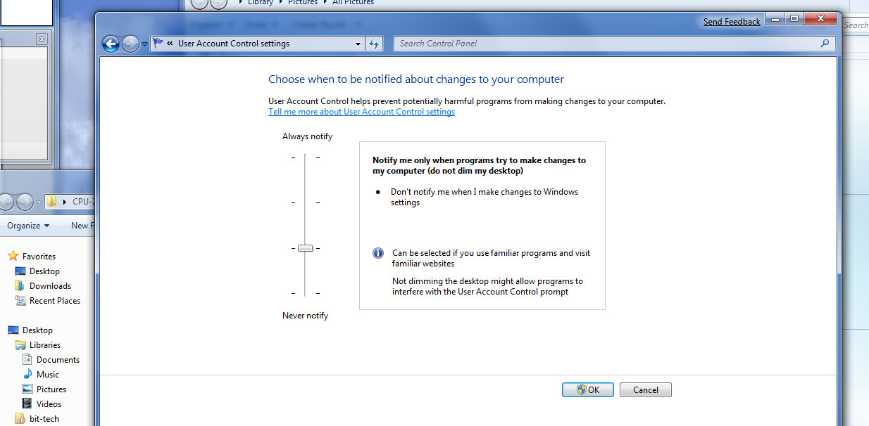
 The "show desktop" button has been updated so now when it's hovered over, all the open windows become transparent, allowing you to see your desktop gadgets underneath - very useful (if you use gadgets). However we're not happy that Microsoft moved the button to the bottom right past the date and time. We can understand that throwing the mouse carelessly to bottom right is easier than accurately positioning it over a small icon, but it's literally become a slither of transparent pixels that looks like Microsoft doesn't quite know what to do with it yet.
The "show desktop" move is only part of the situation though, because Microsoft has removed the quick launch section entirely - what the hell? (I never use it myself personally and turn it off - Ed.) To alleviate this loss of fundamental functionality is a new "icon-only" taskbar. This now features the ability to "pin" programs or folders to it, so they sit uniformly alongside the other normally open programs.
Rolled into this is the advantage that instead of just a standard right-click menu now - these taskbar options have customised ones: for example, Internet Explorer 8 has recently visited sites, Windows Media Player will have recently watched/listened to media, as well as "play all music shuffled" while a the pinned folder explorer lists the usual common places, plus recently visited (very useful!).
If you're a fan of the sidebar widget in Vista, but find them limited to the one side, the Windows 7 widgets are now completely moveable to anywhere on the screen. This means they can be bunched in a corner, put along the top, or dumped on a second/third monitor, depending on what your habits are.
Essentially, it makes them much more user friendly but they still currently fall under "sidebar.exe" and its generally a high memory usage application and for that reason we prefer to disable it.
 The sharing options are finally all together in one big list, but it's no better than it was before. For anyone who's tried to get a simple network share working in Vista knows this process is one long epic fail.
 The Network and Sharing Centre in Vista is the home of much madness and, while thankfully all those pointless little clickable arrows are done away with, all the unnecessary options are still there. Instead of having a single global "just share the directories I enable sharing on" setting, there are still pointless "public folders" and files are different from media, and media now has more options too.
OK, so these extra options are actually useful: being able to limit sharing to a particular network and even a specific PC is a great idea, but it's a convoluted mess. Why didn't Microsoft just allow these options to be set on a per-directory basis? Right click a folder, "share this folder," set who you want to share with and if they can do it anonymously. Job done. If people are too stupid to learn this simple technique then remove their keyboard and mouse, and then their car keys and passport as well.
Although the drivers are still early, Microsoft has finally acknowledged that people often use more than one monitor, and monitors can actually swivel to do portrait function too. This is very useful if you're buying a widescreen monitor with the intention of using them to write long documents or view web pages.
While over a year ago now I admit, having tried this previously and unsuccessfully with three monitors and wanting just the one to be portrait, this proved too much of a task for Vista and it promptly laughed itself into a cripple-fit and refused to acknowledge the portrait function even existed. Getting to the display settings is no longer the extra click away that Vista introduced, it's now back as part of the right click on desktop, display option like it was in Windows XP.
Reading around, some bloggers or commentators have written that Windows 7 should be a free upgrade to Vista, or that some of these fundamental UI changes should be a part of a future Vista Service Pack. While we would love it and can sympathise, we certainly can't see a free upgrade from Vista - Apple charged for the Tiger to Leopard "upgrade," after all.
 The UI changes for Vista we'd love to see though - we already know DirectX 11 will be available for Vista but some of the Windows 7 improvements are so fundamentally awesome, we deem them necessary to make Vista user friendly.
Overall the general consensus is a thumbs up - we like the changes or at least we can get used to a few of them (except the "show desktop" button move! Boo!). The problem is, everyone goes through the motions: first you have the novelty of it, then you have the getting used to it, then you have the need to change parts of it, but finally we all end up at acceptance.
In one afternoon I've gone through novelty and familiarity in a short few hours and now I'm onto wanting to change it, yet feel acceptance will be a while off yet. After the scars of Vista, actually having the hope of positive change again might actually be too much for some and the calls for "more changes" from everyone with a blog or website (Ahem - Ed), will no doubt resonate through the Internet. Essentially, even if Microsoft does make or has made a better product, I doubt it can win.
People will want to change it to suit their personal tastes entirely. Whether that's as vanilla as a Windows 2000 clone, or as painfully crazy and full as a MySpace page: in a world and future of completely customisable experiences, does the "one size fits all" model still work? I doubt it will, and the quicker Microsoft realises that the better.
RELATED ARTICLES


MSI MPG Velox 100R Chassis Review
October 14 2021 | 15:04


Want to comment? Please log in.